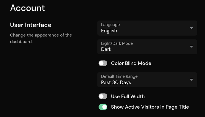
Hey, would be cool to have color blind friendly (not red/green) scheme for the comparison chart feature. E.g. blue current period; gray previous period, or whichever you find working based on your style guide. Thanks for considering it! Cheers
Hi! Thank you for the suggestion, I’ve added it to our backlog for the next update (coming soon)! ![]()
1 Like
Hey Marvin, thanks for the newest release, but I must be also blind because i don’t see the option to activate the color blind theme in Account > Settings ![]()
1 Like
